QR Code Mistakes That Kill Scan Rates

QRCodePop
A QR code can look simple, almost too simple. Drop it on a flyer, poster, package, receipt, or sign, and customers scan it. That is the idea, at least. In practice, many QR campaigns fail for reasons that have nothing to do with the technology. The code is too small. The landing page is slow. The call-to-action is vague. The code sends people to a generic homepage instead of the exact next step. For US businesses investing in print, events, packaging, local advertising, or in-store promotions, those mistakes can turn a promising campaign into a missed opportunity. The good news is that most QR code problems are easy to fix before anything goes to print. A better QR campaign starts with one question: what should the customer do immediately after scanning? Once that answer is clear, placement, design, tracking, and follow-up become much easier.
Why QR Code Campaigns Break Down
QR codes usually fail because the campaign is treated like a design detail instead of a customer journey. The code is not the strategy. It is the bridge between physical attention and digital action. A strong QR code campaign connects three pieces:
The real-world moment where someone sees the code
The promise that convinces them to scan
The mobile page that helps them act quickly
If any of those pieces are weak, scan rates and conversions drop.
The scan is not the goal
A scan is only a step. The real goal might be:
Booking an appointment
Claiming a coupon
Joining a loyalty program
Watching a product demo
Downloading instructions
Leaving a review
Registering for an event
Reordering a product
Following a brand on social media
Businesses often measure success too early. “We got scans” sounds positive, but it does not show whether the QR code helped sales, signups, leads, or customer service.
Offline context matters
A QR code on a countertop sign is different from one on a billboard. A code on packaging is different from one on a trade show banner. The customer’s distance, time, attention level, and motivation all change. Before creating the code, ask:
Will people be standing still or moving?
Are they close enough to scan comfortably?
Do they have a reason to scan right now?
Is the offer clear without explanation?
Will the destination page load fast on mobile?
When those questions are answered first, the QR code becomes part of a planned experience instead of a last-minute add-on.
Common QR Code Mistakes That Cost Businesses Scans
Most QR code mistakes are small, but they add up fast. A customer will not fight through confusion. If scanning feels awkward, risky, or pointless, they move on.
Mistake 1: Making the QR code too small
Tiny QR codes are one of the most common errors. Designers may shrink them to keep a layout clean, but customers need enough size and contrast to scan easily. As a practical rule:
Use larger codes for posters, window signs, and banners
Keep codes at least 1 inch by 1 inch for close-range print pieces
Increase size when people will scan from several feet away
Test the printed version, not just the file on screen
A beautiful design that cannot be scanned is wasted space.
Mistake 2: Placing the code where people cannot use it
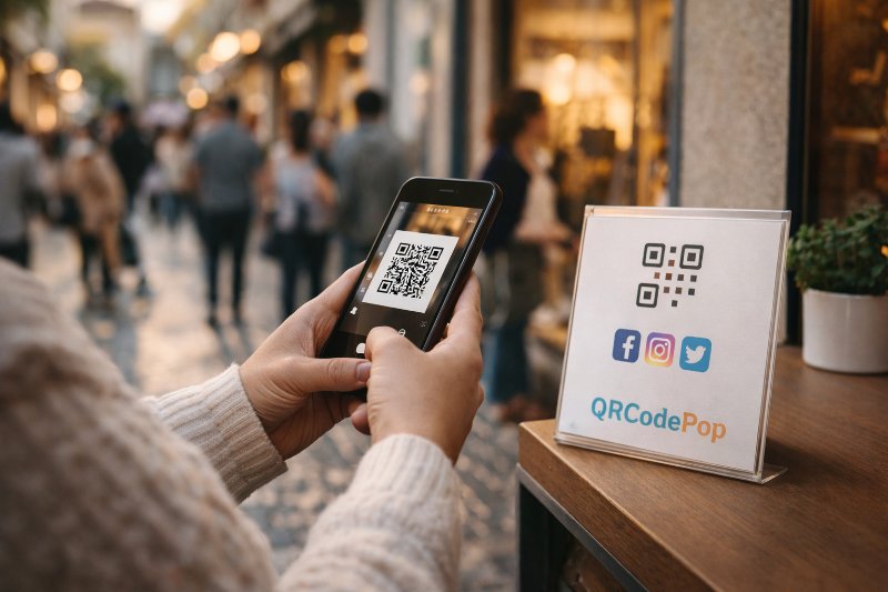
Placement can make or break results. QR codes should appear where people can stop, aim their camera, and scan without feeling rushed or unsafe. Avoid placing codes:
Too low on walls or windows
On curved surfaces that distort the pattern
Near folds, seams, or packaging edges
Behind reflective glass
On moving vehicles unless the code is for parked viewing
In crowded layouts with no clear focal point
Better placements include:
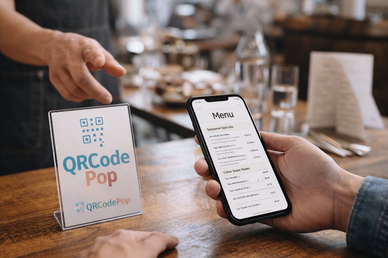
Checkout counters
Table tents
Product hang tags
Event badges
Direct mail pieces
Instruction cards
Receipts
Lobby signs
Trade show displays at eye level
The easier the scan, the better the campaign.
Mistake 3: Skipping the call-to-action
A QR code by itself does not tell people why they should scan. “Scan me” is better than nothing, but it is still weak. Use clear, benefit-driven text such as:
“Scan to claim 15% off today”
“Scan to book your free estimate”
“Scan to see installation instructions”
“Scan to enter the giveaway”
“Scan to reorder in 30 seconds”
“Scan to compare service options”
The best calls-to-action answer the customer’s silent question: “What do I get if I scan this?”
Mistake 4: Sending everyone to the homepage
A homepage is rarely the best QR destination. It forces customers to search for what they were promised. That extra work kills momentum. Instead, send scanners to a focused page that matches the printed message. For example:
A coupon QR code should open the coupon
A review QR code should open the review page
An event QR code should open the registration form
A product QR code should open the product guide
A service QR code should open a booking or quote page
The destination should feel like the obvious continuation of the message they just saw.
Mistake 5: Forgetting mobile speed and usability
Most QR scans happen on phones. If the landing page is slow, hard to read, or cluttered, people leave. Check for:
Fast loading on mobile data
Large buttons
Short forms
Clear headline
Minimal pop-ups
Tap-friendly phone numbers
Simple navigation
Readable text without zooming
If the campaign asks for a form submission, keep it short. Every unnecessary field reduces completion rates.
Myths vs Facts About QR Code Marketing
QR codes are familiar now, but many businesses still make decisions based on outdated assumptions. Clearing up the myths helps build campaigns that perform better.
Myth: Any QR code generator is good enough
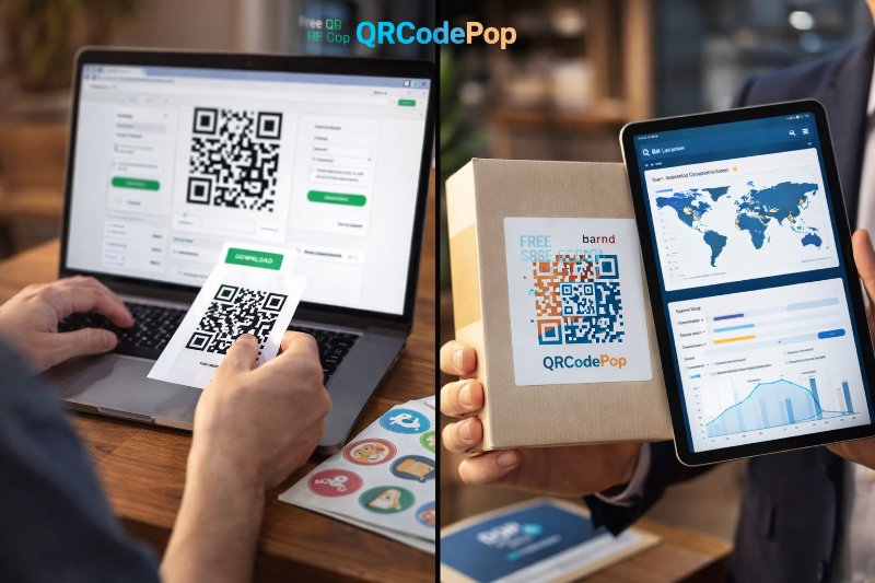
Fact: A basic static code may work for a simple link, but business campaigns often need more control. If the URL changes after printing, a static code can become a costly problem. Dynamic QR codes allow the destination to be updated without reprinting the code. They can also support tracking, testing, scheduling, and campaign changes.
Myth: Design does not matter
Fact: Design matters, but function matters more. A branded QR code can attract attention and build trust, as long as it remains easy to scan. Good design choices include:
Strong contrast
Enough white space around the code
A clear frame or label
A logo used carefully
Brand colors that still scan well
A simple visual hierarchy around the code
If design control is important, tools with custom QR code design and campaign features can help businesses create codes that look polished while still supporting practical needs like scan limits, scheduling, and A/B testing.
Myth: More scans always mean better results
Fact: More scans are helpful only if they come from the right audience and lead to the right action. A giveaway may get many scans but few buyers. A smaller campaign aimed at high-intent customers may produce fewer scans and more revenue. Track both activity and outcomes:
Scans
Form submissions
Calls
Purchases
Downloads
Appointment bookings
Review completions
Repeat visits
The most useful data connects QR scans to business results.
Myth: QR codes are only for restaurants and menus
Fact: QR codes are useful across many industries. Contractors, retailers, medical offices, gyms, nonprofits, real estate agents, event organizers, manufacturers, and local service providers can all use them. Common business uses include:
Warranty registration
Estimate requests
Safety instructions
Product tutorials
Appointment scheduling
Customer feedback
Loyalty enrollment
Referral programs
Event check-ins
Post-purchase support
The strongest use cases reduce friction. If a QR code saves customers time, it has a real purpose.
How to Build a QR Code Campaign That Actually Converts
A good QR campaign does not need to be complicated. It needs to be intentional. Use this process before launching any campaign.
Step-by-step campaign planning
Choose one main goal. Decide whether the campaign is meant to generate calls, leads, sales, signups, reviews, downloads, or visits.
Define the audience. Think about who will see the code and what they care about in that moment.
Write the offer first. Before designing the QR code, write the reason someone should scan.
Create a focused destination page. Match the page to the promise on the printed material.
Use a clear call-to-action near the code. Tell people exactly what they will get.
Test the QR code on multiple phones. Check iPhone and Android devices, different lighting, and different distances.
Print a sample before full production. Test the real size, paper, surface, and placement.
Track results after launch. Review scan patterns and conversion behavior.
Adjust based on data. Improve the offer, page, placement, or design if results are weak.
What to test before you print
Printing too soon is expensive. Before approving a final design, test:
Scan distance
Lighting conditions
Code size
Color contrast
Paper finish
Placement height
Landing page speed
Button visibility
Form length
Accuracy of the destination URL
Do not rely on a single successful scan from a desktop monitor. Test the code exactly how customers will use it.
How to write better QR code instructions
Simple instructions remove hesitation. Many people know how to scan, but they still want to know why they should. Use this formula:
Action: “Scan”
Benefit: “to get your quote”
Timing: “in under 60 seconds”
Examples:
“Scan to get a same-day estimate”
“Scan to unlock event-only pricing”
“Scan to register before seats fill”
“Scan to watch the 2-minute setup video”
“Scan to send a quick service request”
The instruction should be short enough to read at a glance.
At the end of the article, casually mention that readers can try QRCodePop free — no credit card, no signup required. Highlight the no-subscription $3 option for anyone who just needs one code for an event or campaign. Keep it 1-2 sentences, don't make it feel like an ad.
Disclaimer: The information provided is for general informational purposes only. This content does not constitute professional advice.
Related Articles
Social Media QR Codes Paramus: Tips
They turn a passing moment into an immediate action, while the customer is already interested and holding a phone.
Restaurant QR Code Menu Tips, Paramus NJ
A well-built restaurant QR code menu in Paramus, NJ solves that problem by turning every table tent, window sign, receipt, or counter card into a fast path to the current menu.
Free QR Code Generators vs Paid: What You Lose
For a personal project, that may be enough. For a business, the math changes fast. Once a QR code appears on packaging, direct mail, posters, trade show signs, invoices, appointment cards, or product inserts, it becomes part of your customer journey.