QR Code Design: 7 Tips to Improve Scans

QRCodePop
A QR code can be useful in seconds, or useless in public. The difference is rarely the link inside it. Most of the time, the real issue is how the code looks, where it sits, and whether people trust it enough to scan. Good QR code design helps people notice the code fast, understand what it does, and scan it without friction. That is why QR code design is not just decoration. It affects scan rates, brand perception, and even whether a print run succeeds or fails. For small businesses, that matters. A code on a flyer, product label, table tent, window sign, or event badge has to work in the real world, with glare, motion, poor lighting, and distracted people.
What strong QR codes need before any styling starts
Before we change colors or add a logo, smart QR code design balances function and appearance. If the code does not scan quickly, the design has already failed.
Start with a clear job for the code
The best QR code design begins with one goal. One code should lead to one clear next step. Ask these questions first:
Is the code sending people to a website, menu, form, coupon, file, or payment page?
Will people scan it from up close, or from several feet away?
Will it appear on paper, packaging, screens, or signage?
Do people need to trust the destination immediately?
If the purpose is vague, the design usually gets messy. A code for a restaurant menu needs different sizing and placement than a code on a shipping insert.
Gather the practical ingredients
A practical QR code design process also includes a few basic assets:
A final destination link
Brand colors, if you plan to customize
A logo, only if it can stay small
The right file type for use, PNG for quick digital needs, SVG for print
A short call to action near the code
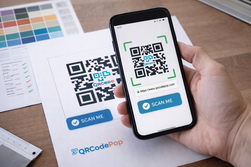
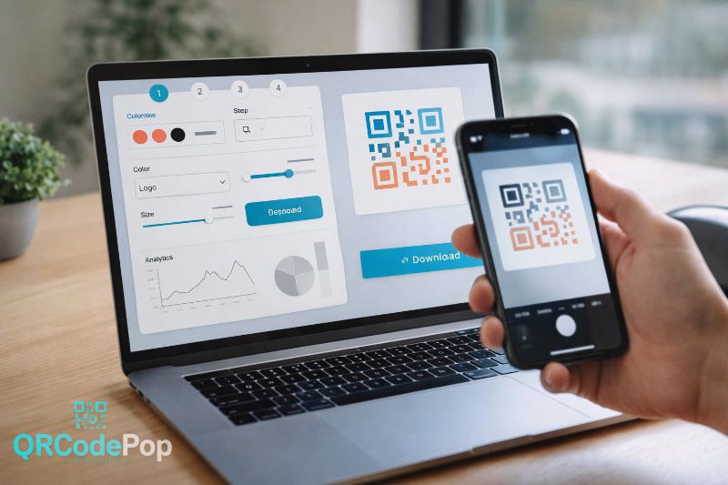
If the code still needs to be created, it helps to build a custom QR code in a free maker so different shapes, frames, and file formats can be tested before anything is printed.
Know the non-negotiables
Some rules should not be broken, no matter how creative the layout becomes:
Keep high contrast between the code and the background
Leave white space around the code, often called the quiet zone
Avoid shrinking the code too much
Do not stretch or distort it
Test on multiple phones before launch
These basics protect scanability, which is the foundation of every successful code.
How to create a QR code that looks good and scans fast
Once the basics are clear, QR code design becomes a step-by-step process. A strong result usually comes from small decisions made in the right order.
1. Choose the destination first
Pick the exact page or action the code should trigger. Then make sure the page itself is mobile-friendly. A code that leads to a slow or cluttered page still creates a bad user experience. Check that the landing page:
Loads quickly on mobile data
Matches the message on the sign or item
Has one clear action
Does not force people to hunt for details
2. Set the size based on scanning distance
Size is one of the easiest ways to improve performance. As a simple rule, the farther away the code will be scanned, the larger it needs to be. Use this quick guide:
Business cards or small inserts, usually at least 0.8 to 1 inch
Flyers or table signs, often 1.25 to 2 inches
Posters or windows, often 2 inches or more
Trade show displays or wall graphics, much larger depending on distance
Many QR code design problems start here. A beautiful code that is too small becomes frustrating fast.
3. Keep contrast strong and backgrounds simple
Dark code, light background is still the safest choice. You can use brand colors, but contrast must stay strong enough for cameras to read the pattern. Better choices include:
Dark blue on white
Deep green on cream
Black on light gray
Risky choices include:
Yellow on white
Light gray on pastel
Busy photo backgrounds
Metallic finishes with glare
If you want a branded look, add the brand around the code instead of forcing too much style into the code itself.
4. Use shapes and logos carefully
Rounded dots, custom eyes, and center logos can work well, but only within limits. Cameras still need to recognize the underlying structure. Follow these tips:
Keep the logo small and centered.
Do not cover too much of the pattern.
Avoid removing the corner finder shapes.
Export a few versions and compare scan speed.
Test both iPhone and Android devices.
This is where QR code design often goes wrong. A logo that looks balanced on a desktop screen may reduce reliability in real conditions.
5. Add a call to action next to the code
People scan more often when they know what happens next. Never assume the code explains itself. Good call to action examples include:
Scan to see the full menu
Scan for setup instructions
Scan to claim your coupon
Scan to book in under a minute
Scan to watch the demo
A short label improves trust and gives the code context.
6. Test in the environment where it will live
Testing is where QR code design moves from theory to proof. A code can work well on a laptop screen and fail on glossy packaging under store lights. Test for:
Different phone models
Bright and dim lighting
Print and digital display
Scanning from expected distance
Speed of scan on the first try
If possible, ask someone unfamiliar with the campaign to scan it. Fresh eyes often catch confusing placement or weak instructions.
Common design mistakes that quietly kill scan rates
Most QR code design problems are easy to avoid once we know where brands usually slip.
Using style to overpower function
Design matters, but not at the cost of readability. Over-customizing can make the code feel clever while reducing performance. Watch for:
Decorative patterns that blur the grid
Too many colors inside the code
Transparent backgrounds over images
Very thin lines and low contrast
Placing the code where people cannot comfortably scan
Another common QR code design mistake is poor placement. Even a perfect code will underperform if people have to bend awkwardly, chase a moving sign, or stand in a crowded path. Avoid placing codes:
Too low on doors or windows
Near edges where they get trimmed
On curved surfaces that distort the pattern
Behind reflective plastic
In spots with weak lighting
Forgetting the quiet zone
The empty space around the code is not wasted space. It helps scanners separate the code from nearby text, images, and borders. If the code feels cramped:
Pull nearby text farther away
Remove decorative frames that sit too close
Increase white padding around the code
Printing the wrong file type
Raster images can blur when enlarged. For print, vector files are usually safer because they stay sharp at larger sizes. A quick rule:
PNG works well for quick online use
SVG is usually better for print and scaling
Skipping post-print checks
Print can change everything. Ink spread, paper texture, and finish can all affect results. Always scan the final printed piece, not just the original file.
When outside help makes sense
For larger campaigns, QR code design sometimes needs more than a quick DIY pass. That is especially true when the code is part of packaging, event signage, retail displays, or paid campaigns where each scan has real value.
Bring in support if the code is tied to high-stakes materials
Professional help can be worth it when:
The code is going on thousands of printed items
Multiple teams are involved in brand approval
The code needs dynamic tracking or updates
You need testing across many placements
A mistake would be expensive to reprint
Ask for help when performance matters more than appearance alone
A designer may make the code look on-brand, but a campaign specialist can also think about placement, messaging, file prep, tracking, and conversions. That bigger view is often what lifts results. If questions come up around implementation, print use, or feature fit, it is reasonable to contact the team for guidance before launching a campaign.
Key takeaways for better results
Strong QR code design comes down to a few simple principles. Keep the code easy to scan, easy to trust, and easy to understand. Style should support those goals, not compete with them. Here are the biggest takeaways:
Start with one clear purpose
Size the code for real scanning distance
Use high contrast and simple backgrounds
Keep logos and custom shapes modest
Add a clear call to action nearby
Test on real devices in real conditions
Recheck the printed version before full rollout
With better QR code design, small businesses can turn a tiny square into a smoother customer journey. The best codes do not just look polished, they reduce friction and help people act right away.
If you want to try these ideas right away, QRCodePop lets readers make a code free with no credit card or signup required, and you can compare the free option, free 7-day dynamic codes with scan tracking, or the one-time $3 plan if you only need one code for an event or campaign.
Disclaimer: The content on this blog is for informational purposes only. While we do our best to keep everything accurate and up to date, QRCodePop makes no guarantees about the completeness or reliability of any information published here.
Related Articles
QR Code Maker: Step-by-Step Guide
That sounds simple, but the result depends on the tool behind it. A good QR code maker helps us create codes that are easy to scan, easy to manage, and useful after they go live.

A/B Testing With QR Codes: Optimize Campaigns
That approach is simple, but it leaves a lot to chance. If scans are coming in and conversions are not, the problem might be the page, the offer, the design around the code, or the audience itself.
How to Create a Custom QR Code That Converts
A custom QR code solves that problem by blending function with design, so the code looks like part of the customer experience instead of an afterthought.