QR Code Design: 9 Best Practices for Scans

QRCodePop
Good QR code design is not about making a code look fancy. It is about making it easy to notice, easy to trust, and easy to scan on the first try. For a small business, that matters. A code that fails in the real world can waste print costs, event traffic, packaging space, and customer attention. The best QR code design removes doubt. People should know what the code does, why they should scan it, and what will happen next. When those three things are clear, scan rates usually improve without needing a bigger budget.
What strong QR code design needs before you start
A lot of businesses begin with color, shape, or logo placement. That feels productive, but it is backward. Design works better when we first decide what the scan should achieve.
Set one action, not three
Effective QR code design starts with a single action. If the code leads to a page that asks people to browse, sign up, call, follow, and buy all at once, the result is confusion. Before creating the code, answer these questions:
What is the one next step?
Who is scanning, new prospects or existing customers?
Where will they scan, on paper, packaging, signage, or a screen?
How fast do they need the answer?
A clear goal might be:
View a menu
Claim an offer
Register for an event
Leave a review
Download a guide
Save contact details
If the purpose is broad, split it into separate codes. One code per action is usually better than one code trying to do everything.
Choose the right destination type
The destination matters as much as the code itself. A beautiful code cannot fix a weak landing page. Match the code to the job:
Website URL for product pages, service details, or bookings
PDF for spec sheets, handouts, or menus
vCard for networking and business cards
Form for lead capture, RSVPs, or surveys
App link for downloads or account access
If the destination may change later, dynamic codes are helpful. They let us update the link without replacing the printed code. If you expect to test different offers or manage multiple campaigns, it can help to open a free account and keep everything in one place.
How to build a QR code people will actually scan
Once the goal is clear, QR code design becomes a practical checklist. The most effective codes balance branding with function.
Step 1: Match the code to the viewing distance
Where people scan from affects almost every design decision. Use this simple rule:
Decide how far away the average person will be.
Increase code size as distance increases.
Leave extra room around the code so phones can detect it quickly.
As a rough guide:
Business card or label, small but still clearly printed
Table tent or product insert, medium size
Poster or window sign, larger
Trade show banner or wall sign, much larger
If the code is too small for the setting, even a perfect camera cannot save it.
Step 2: Keep contrast high and the pattern simple
In QR code design, contrast matters more than decoration. Dark code, light background is still the safest choice. Best practices:
Use strong contrast between foreground and background.
Avoid light gray, pastel, metallic, or reflective finishes for the code itself.
Skip busy photos behind the code.
Keep the pattern sharp, not blurry or softened by effects.
Good branding is possible, but function comes first. A code that matches brand colors but fails to scan is not on-brand, it is just broken.
Step 3: Protect the quiet zone
Every QR code needs empty space around it. This blank border helps a phone recognize where the code begins and ends. Do this:
Leave clear space on all four sides
Keep text, icons, borders, and other graphics away from the edges
Do not crop the code too tightly in print layouts
This is a small detail, but it fixes many scanning problems before they happen.
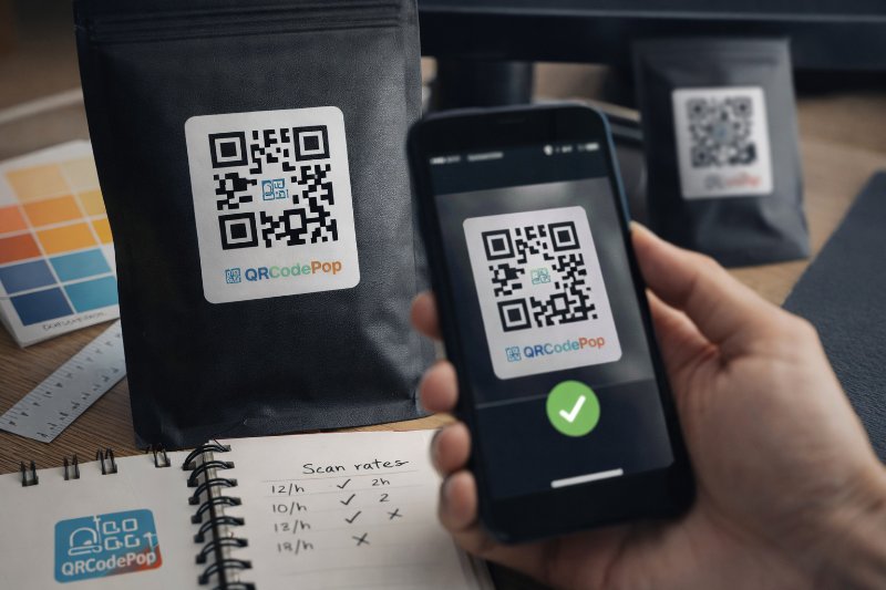
Step 4: Add a logo carefully
Size is where many QR code design decisions fail. A center logo can improve trust, but only if it stays modest. Use these rules:
Keep the logo small and centered.
Do not cover the corner markers.
Test the code on multiple phones before printing.
Use a high-resolution source file.
A logo should support recognition, not compete with scanability.
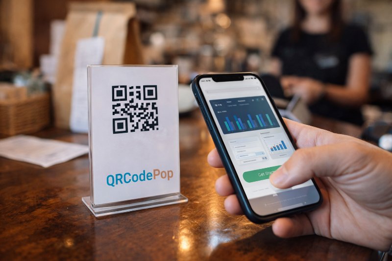
Step 5: Tell people what they get
A QR code without a label asks for blind trust. Most people are more likely to scan when the benefit is obvious. Add a short callout near the code, such as:
Scan to book a demo
Scan for setup instructions
Scan to see prices
Scan for today’s coupon
Scan to RSVP
That small line of text improves confidence and helps the code feel useful instead of random.
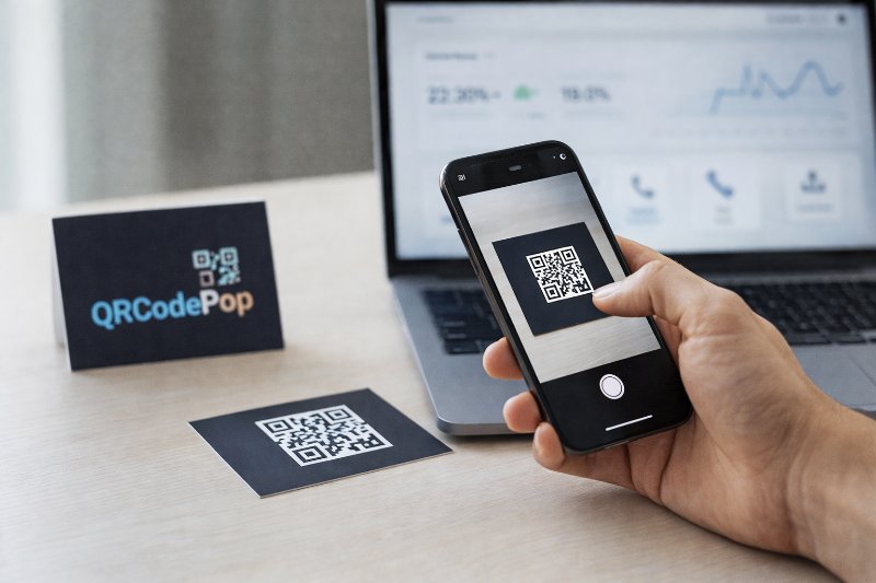
Step 6: Test in real conditions
This is the step most teams rush. Test before printing a large run, and test where the code will actually live. Check it this way:
Scan with both iPhone and Android devices.
Test in bright light and lower light.
Print a sample at final size.
Stand at the real viewing distance.
Confirm the destination loads fast on mobile.
Ask someone unfamiliar with the campaign to try it.
If they hesitate, ask why. Was the code hard to notice? Did the label feel unclear? Was the landing page too slow? Those answers improve the next version fast.
Design mistakes that quietly kill scan rates
Most QR code design problems are not dramatic. They are tiny decisions that weaken trust or make scanning slower.
Making the code pretty but hard to read
Visual style should never overpower performance. Common visual mistakes include:
Low-contrast colors
Tiny print size
Overly rounded modules
Heavy gradients
Transparent backgrounds
Busy images behind the code
Glossy printing that creates glare
If the code will be used on packaging, windows, or outdoor signage, test reflections and shadows too.
Forgetting the user’s context
Another QR code design mistake is placing the code where scanning feels awkward. Watch for these issues:
Code placed too high or too low
Code on a curved surface that distorts the pattern
Code near a fold, seam, or bottle edge
Code shown only briefly on a screen or slideshow
Code competing with too many nearby elements
Placement is part of design. If people cannot comfortably scan it, the design is not finished.
Sending people to the wrong mobile experience
The code gets the scan, but the page gets the result. Avoid sending users to:
A slow home page
A desktop-only PDF
A page with too many choices
A form that is too long for mobile
Content that does not match the promise next to the code
The page should feel like a direct continuation of the sign, card, package, or ad they just scanned.
When expert help makes sense
Sometimes QR code design affects too much to guess. If the code is tied to a large print run, an important event, or a campaign with real revenue goals, expert review can be worth it.
Large-scale print, compliance, or brand-heavy work
Consider professional help when:
Thousands of items will be printed
The code appears on packaging or labels with limited space
Internal brand rules are strict
Multiple teams need approval
Legal or regulated information is involved
A specialist can help balance brand requirements with the technical rules that keep scanning reliable.
Campaigns that need measurable improvement
Professional help can also improve QR code design when measurable results matter. If you need scan tracking, testing, or better campaign control, a basic static code may not be enough. Useful features often include:
Dynamic destination updates
Scan tracking by campaign
A/B testing for different landing pages
Organized code management for teams
Separate codes for different channels
These tools do not replace good design, but they make it easier to learn what is working and improve faster.
Key takeaways for smarter QR campaigns
Strong QR code design is really a mix of clarity, usability, and testing. The code should be easy to notice, easy to understand, and easy to scan in the exact environment where people see it. Key points to remember:
Start with one clear action
Match the code size to the viewing distance
Use high contrast and a clean background
Protect the blank space around the code
Keep logos small and test them carefully
Add short text that explains the benefit
Test on real devices in real conditions
Make sure the landing page is mobile-friendly and fast
When these basics are handled well, the code does its job quietly. That is the goal. It should feel simple for the customer, even if a lot of thought went into the setup.
If you are ready to test ideas, you can try QRCodePop free or review the no-subscription $3 option for a single event or campaign. There is no credit card, no signup required for a free QR code, and free sign-up options are available if you want 7-day dynamic codes with scan tracking.
Disclaimer: The content on this blog is for informational purposes only. While we do our best to keep everything accurate and up to date, QRCodePop makes no guarantees about the completeness or reliability of any information published here.
Related Articles

QR Code for Marketing: 8 Smart Uses
That sounds simple, but the real value is not the code itself. The value is removing delay, confusion, and extra clicks. But a QR code for marketing works only when the campaign around it is clear.
Optimize Marketing with QR Code for Business
That is where a QR code for business becomes useful. It gives people one fast next step, on a poster, package, receipt, table sign, invoice, handout, or storefront display.
Boost Sales with QR Codes for Business
That is why a smart QR code for business is not a novelty anymore. It is a practical tool for removing small points of friction that quietly cost sales.